Tuesday 31 January 2012

Bubble Calendar 2012


Designed in Brooklyn, NY by Bubble Calendar LLC, this poster-sized calendar (122 x 46 cm) has a bubble to pop for every single day of the year.

Set in Helvetica Neue and with a very simple and elegant design,  it’s a very appropriate tool for both design-conscious and modern homes or offices as well as a fun learning tool for kids (who are we kidding, adults would love to pop those bubbles too).

Days of the week and all major holidays and weekends are marked in bold for easy reference (there is also a version with weekends marked by black backgrounds) in English, French, Spanish, German and Italian. The calendar is printed on thick paper (80 pound cover stock) and can even be customized with a personal logo.

Photography by Alex Kotlik.

Monday 30 January 2012

Tina


Tina is a bathtub designed by the multidisciplinary studio Lavernia & Cienfuegos Design for Sanico.

The designers have developed a contrast between rounded and comfortable shapes and others squared and straight. It is made of mineral resin, which makes the solid and smooth appearance possible, resulting in a functionality design.

Friday 27 January 2012

Catena Wall Clock


Designer Andreas Dober brings the Catena Wall Clock produced by Anthologie Quartett, still seems familiar in its analog mechanical nature.

The Catena — named after the Latin word for chain — rotates a vertical bicycle chain with attached brass numbers in a clockwise direction. At the top of every hour the time appears at the zenith of the rotation. Between hours you can eyeball the amount of chain between numbers and get a surprisingly accurate estimate of the time. In the above clock photo, for example, it is approximately 11h:05m.

Thursday 26 January 2012

My Book


Milan based Italian designer and architect Denis Guidone has recently created My Book for Nava Design.

This is not a notepad or a sketchbook per se (although it could perhaps be used as such), but instead it is a book to encourage storytelling. My Book is available in brightly bound red, white and black.

Wednesday 25 January 2012

Vincent Van Duysen


Vincent Van Duysen is a Belgium architect whose work use of singular element, frequently in a large scale, typically either defines the interiors or directs viewers’ attention to that particular element. White space, panelled walls and strong geometrical shapes usually characterize his designs.

Tuesday 24 January 2012

Hila Gaon store


This concept store and atelier for fashion designer Hila Gaon was designed by Karina Tollman and Philipp Thomanek of Israeli studio k1p3 in Tel Aviv.

The gallery-like space features 9 dresses from the current collection, hung in prominent display upon store mannequins (which were custom-made by the architects, based on traditional seamstress dolls). The complete collection, for its part, is stored in a translucent and lit closet along the length of one wall, and the main space is completed by a large dressing room and fitting area that are provided for the bride and her entourage.

Photography by Ardon Barhama.

Monday 23 January 2012

KINK


Osko+Deichmann, the product design studio founded by Blasius Osko and Oliver Deichmanncreated a minimalist family of tubular steel furniture named “KINK”. While normally tubing used in furniture is bent the Berlin design duo rather functionally folded, dented and kinked the tubes in their furniture pieces. The traces that come with the steel process are now integral to the furniture’s design.

The family consists of a table, chair, writing table, cantilever chair, sideboard, shelf, coffee table and floor lamp made exclusively of tubular steel, pine wood and clamps.

Sunday 22 January 2012

Viewpoint by LBJ


LJB, a Norwegian based architecture team, were assigned to design the Vedahaugane lookout, at the Norwegian national tourist Route Aurlandsfjellet. 

This project could be described as a pathway to nowhere. It is a 90m long curve shaped construction – a concrete line that seems to float above the terrain. A minimal approach with the minimum environmental footprint.

Photograph: E. Marchesi

Saturday 21 January 2012

Rest Stop by LBJ


This project make a clear statement about creative and sustainable interaction of nature and architecture. LJB, a Norwegian based architecture team, were assigned to design the Flotane rest stop, at the Norwegian national tourist Route Aurlandsfjellet.

This one consists of 1200sqm parking area and a tilted, concrete, cube structure that serves as toilet. A simple yet so thoughtful design creates a well protected entrance to the toilet service while at the same time the south façade is covered by solar panels; a solution that allows daylight to enter the interior while protecting it from indiscreet eyes.

Photograph: Statens Vegvesen

Friday 20 January 2012

White Dormitory


White Dormitory is a renovation project recently completed by Japanese designer Koichi Futatsumata of Case-Real. Located on Teshima Island, Japan, this dwelling provides accommodation for three employees of nearby restaurant Il Vento. The bones of the initial house were carefully preserved, allowing to insert new elements without disturbing the surrounding landscape of the village which remains unchanged from the old days. 

The interior is comprised of three bedrooms, arranged on one side of the building. The common area is characterized by the beautiful contrast between the monochromatic colour palette and rustic wooden beams. The line of skylights brings constant flow of natural light into the room. The small courtyard with the long white terrace connects the inside and outside of the building and creates the illusion of a much bigger space.

Thursday 19 January 2012

Serpens Collection by Qiu Hao


The Serpens collection lookbook is the product of the collaboration between the Chinese fashion designer Qui Hao and the Shanghai based, French photographer Matthieu Belin.

Named after the constellation of the northern hemisphere – the reptile, the mythological symbol that represents both good and evil – Serpens is as mysterious, futuristic and compelling as its name implies. An extravagant collection in which the size is the absolute dominant. Oversized clothes touched by the magic wand of minimalism. The use of black and white (evil / good) and the absence of colours add an extra dramatic dimension while emphasizing the simple, geometric lines that hide behind the original idea. An unfinished game between textures and sizes.

The photography concept is working on the same wavelength. Models like mannequins form geometric shapes with their bodies within the photo frame. Again, the absence of make up and the elimination of shadows produce a neutral canvas, where the clothes seem the only thing alive. Bodies like robots, clothing like structures, a rather architectural approach in a fashion photo shoot.

Wednesday 18 January 2012

(un)defined spaces


Matthias Schade was born in 1984 in Berlin, Germany. His latest work is a series of photographs named (un)defined spaces – an investigation of urban space. An investigation of our living environment.

The artist has been shortlisted for the Celeste Prize 2011 within the photo, digital graphics category back in November 2011.

Tuesday 17 January 2012

Liana


This bookshelf has been designed by the Belgian Pieter Desmijter and produced by the manufacturer and editor of design furniture, Feld.

The bookshelf is called Liana because its design has been inspired by this plant: arising from the wall, curling the books and finally disappearing back  in the wall. It is made from oak with a varnished or stained finish, and you can install it using just two screws.

Monday 16 January 2012

Antiatoms Handbag


Designers Aránzazu Moreno Berriochoa, Sofía Uquillas Zuloaga, and Alejandra Salvatore make up the Madrid based studio Antiatoms, designing and producing corporate apparel with the aim of making the brand’s values visible in each piece.

The Antiatoms Handbag, part of their Paper Containers collection is one of a piece. Measuring 20.5 x 24 x 15 cm, this simple designed accessory gives a slight twist to the common brown paper bag. Instead, the bag uses 100% high quality leather.

Sunday 15 January 2012

The H House


The H House in Maastricht, Netherlands was designed by Dutch architects Wiel Arets Architects and it is the ideal home for the artistically inclined owners. Although the home was built in suburban area, its minimal structure fits in the existing environment without the sacrifice of desired contemporary architecture.

Minimal use of walls in interiors emphasizes the volumes of space, creating the effect of uninterrupted flow. Edited color palette consisting primarily of various shades of white provides soothing backdrop for the play of light and shadows, formed by the geometry of large windows and strong angles of interior structure. Seamless transition is further supported by the use of glass throughout, differentiating in its shape, transparency and opacity. Interesting staircase floats above the ground and even more supports the careful definition of space.

Photography by Jan Bitter.

Saturday 14 January 2012

Living Kitchen


Chicago based industrial designer Michaël Harboun has his distinct idea of the future. He sees it in the implementation of so called ‘programable matter,’ a material comprised of micro robots capable to communicate with each other and change shape and function of any object.

Through his Living Kitchen concept designer attempted to explore how people would interact within this form follows flow environment. The volumes could be stretched, twisted and bend by the user. And as far as technology goes, a material of this kind is currently being researched by Intel and the Carnegie Mellon University under the name of Claytronics. So, the future might be closer than we think.

Friday 13 January 2012

SleepBox


This futuristically looking object, called SleepBox, is designed exclusively for naps. Envisioned by Caspar Lohner and produced by LG Hausys in collaboration with Kläusler Acrylstein AG, the piece creates a place of comfort and relaxation within airports, offices or other public and semi-public spaces, providing peace and quiet in busy urban environments. The free-form shell is made from HI-MACS®, an innovative material, which is comprised of 70% natural stone powder derived from bauxite, 25% high quality acrylic resin and 5% natural pigments.

A porthole on one side of the shell provides an entry to the sleeping capsule, lined with a leather covered mattress. The outer part, thanks to the shape of the object, can serve as seating. SleepBox will be exhibited from 17th to 21th January at Swissbau 2012.

Thursday 12 January 2012

Lilith Rockett


Studio potter Lilith Rockett started her career in ceramics in Los Angeles before moving to Portland. Her work, created by hand on the potter’s wheel, reveals a deep interest in the subtle qualities of the material: translucency, fluidity, density, and the velvety softness of an unglazed polished surface.

Minimal in both form and surface, her work calls attention to subtle nuances of line or shadow, with a delight in the quiet imperfections that characterize the handmade.

Rockett believes that interacting intimately with handmade objects enhances our feeling of connectedness and enriches our daily life.

Wednesday 11 January 2012

Anisha


Renowned Italian lighting company Foscarini have collaborated with Barcelona based design studio Lievore Altherr Molina to produce the simple and understated LED table lamp, Anisha.

Anisha is available in two sizes and two colours – pure white or red. The design is based around a halo of diffused light, creating a backlight effect to see and appreciate the figure of the lamp.

Tuesday 10 January 2012

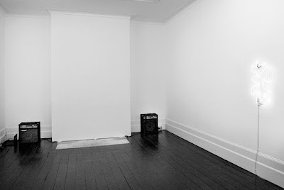
Sounding Space: The Olduvai Cliff


Launching a new series of events exploring the relationship between sound and space, an installation from artist Sam Griffin, in collaboration with musicians Guy Wood and Jo Wills, will flood The Architecture Foundation’s Project Space with a sea of bass, next Monday 16 January 2012 6-9pm.


For one night only – and on the day statistically noted to be the most depressing of the year, Blue Monday – the AF will reverberate at 111Hz, a frequency known to induce endorphins in human physiology. Here, sound is used to transform the physical environment, creating a temporary, invisible, yet penetrating architecture.Griffin’s sonic topography reacts to the space in which it is inserted, creating a changing aural landscape as much felt as heard, as its frequencies – carefully calibrated in response to the specific dimensions of the AF Project Space – refract in stereo around the space.


The installation’s title references the apocalyptic Olduvai Theory – which suggests industrial civilisation will have a lifespan of less than 100 years due to overpopulation, economic burnout, and the depletion of natural resources. The theory’s author, Richard C. Duncan, noted 2012 as the tipping point, or cliff, after which we should expect an epidemic of permanent blackouts worldwide… [until] finally the electric power networks themselves expire.


Image: The Olduvai Cliff. Installation at Gallery Vela, London, July 2011.

Monday 9 January 2012

Humlebaek House in Denmark


The Humlebaek House was a former land workers house, located in Denmark and converted by Danish firm Norm Architecture, into a home-studio. Originally constructed with brick walls, concrete floor and steel beams, it had almost anything an inspiring conversion needs, except one: adequate daylight. And that was the biggest issue. Unable to interfere in the exterior walls, as the building is protected by local architectural restrictions, the architects had but one choice: walls painted white and a new concrete floor treated with shiny epoxy, to help spread the light into luminous spaces that reveal their history.

Sunday 8 January 2012

House Tokyo


House Tokyo has been recently completed by Sanpei Junichi of A.L.X. architects (Architect Label Xain). It is located in and inspired by the city of Tokyo, hence the name. One of the main challenges of the project was to work with the very limited piece of land (the plot was only 480 sq ft). Amazingly, the bright minds of A.L.X. managed to fit 675 sq ft of living space into the structure.

The facade of the building dominates the environment with its crisp whiteness and abstract shape. The windows are covered with perforated metal blindfolds, which obscure the view into the house yet allow enough light from the outside. The choice of the material is a clever and creative nod to the urban setting the house is surrounded by.

Saturday 7 January 2012

BE Light


BE Light is an LED desk lamp for reading, designed by QisDesignWith its hinge design, it can be fully extended to a height of 33.4 cm, and an angle of up to 135 degrees. It also provides adequate task lighting with white LED. When not in use, it can be folded down flat to a minimum height of 1.8 cm, taking up the least amount of space on a desk. It is made of aluminium alloy, which provides a refined metallic finish.

Friday 6 January 2012

Balloon Lamp


Created by designers CrousCalogero for Estiluz, the Balloon Lamp is a  simple, clean and playful lighting fixture, pleasing children and adults alike.

Emitting a soft and warm light, the lamp’s shade is made of satinized polyethylene, a translucent material that hides an energy saving fluorescent bulb. A thin red cable hangs subtly from the shade, serving as a switch in the wall version (a ceiling option is also available).

Thursday 5 January 2012

ORA


Specialising in the design and production of lighting, Australian design studio ilanel, have created ORA – an eclipse-like interactive and contemporary wall-mounted luminary with a minimal aesthetic finish.

It has been designed to encourage personalisation of the colour, influencing the atmosphere in a space. This is done by adjusting three knobs on the face of the design, which represent the colours red, green and blue. Endless interactivity.

Photography by IJ Productions.

Wednesday 4 January 2012

Snake


Maike Timmermann of German design studio, Design fürs Heim, is a Munich based architect, who handcrafts minimalist products for the home. One such product is this simple Snake wardrobe.

This piece of furniture, which could indeed be used in a number of different ways, is made from beech wood balls each measuring 60mm / 40 pcs.

Whether hanging clothes, decorations, or leaving it unadorned as a simple style element in the corner of a room, Snake is a thing of crafted beauty and practicality.

Tuesday 3 January 2012

Revolver


Revolver – a display and storage system based on a reversible shelf design. Revolver is made by the London based design studio Henny van Nistelrooy.

Revolver was developed as part of the retail design commission for Velorution – a London based bicycle store. The shelving system is very flexible and perfect to exhibit objects and garments. The combination of the wood (Douglas fir) and powder coated sheet metal works fine and give the system a subtle elegance.

One can easily adjust the system by hooking one shelf above the other.

Monday 2 January 2012

Contour


This simple and clean-lined lamp concept has been conceived by Chicago based designer Jacob Nitz. The Contour desk lamp is comprised of a single tubular metal structure, bent into an ergonomic shape.

Because the lamp itself comes in black, gray, blue, green, and red, multiple colour combinations can be achieved.

Sunday 1 January 2012

Centro Cívico Ferreries, Tortosa


The old local market of Ferreries, after falling into disuse for several years, has been restored and extended to become the new Cultural Center of this neighbourhood under a project of the architects Olga Felip + Josep Camps.
The main old nave of Ferreries market it’s preserved and through its extension a new transition space is generated in order to enable the connection between the existing building and Joan Monclús square; furthermore, the elevation that defines this public space is completed. The old nave gets involved to the public space intertwining its interior to the exterior through a new access.
An important relation it’s established between the market and its extension, understanding the lines of horizontal composition - cornice and skirting board -, opposing the height of the new facade, contrasting the white interior of the nave, of blended and homogeneous light, of acoustics muffled by wood strips; to a new dark facade, of accentuated shadows by the grooved texture of the material.